|
|
| Forum moderator: bigblog |
| uCoz Community For Webmasters Design Customization About design 1221 (Problems with css, javascript and other issues) |
| About design 1221 |
Hello, I'm opening this thread because I'm using design 1221 but after chenge a lot of styles in the templates I missed out something with the menus (I never change its style nor ohter thing related with it). The problem is that in the default template menus have a background when are in the actual section, ie when you are in the inside the blog the menu item that point to this module have a different background, well, in some place I corrupt the code and my menus does not have background whatever section you are. I guess is some script that I've remove, but after recover the estandar template and compare with my actual template I can't find the script. Please help me.
|
Sunny, http://santiagotravel.ucoz.com the site is not finished yet, so it may looks a little bit horrible
Post edited by osmanys - Tuesday, 2015-07-14, 6:15 PM
|
Sunny, this is the Publisher module, note that in the site menu the section "Publicador" has a green background:
 and this is the Blog module, in the site menu the section "Experiencias" must have a green background like above but has nothing different 
Attachments:
0360572.jpg
(25.6 Kb)
·
2561255.jpg
(39.1 Kb)
Post edited by osmanys - Wednesday, 2015-07-15, 1:45 PM
|
Hello,
I'm using #1221 on one of my web sites and now my client wants to keep horizontal menu on mobile devices template too. I know this type of menu is not typical for responsive design, but what to do, that's what client wants. Can anybody help me with css, because I tried everything and can't solve it. this is web site www.drdakic.com and this is how menu looks like on mobile devices http://prntscr.com/8vjive I want to keep completely same menu like it's on desktop monitors but just adapted to mobile devices. If you need code samples, just let me know, but I didin't change too much regarding this part in #1221 design. |
Hi, HLA!
First, you should find this line in your site's CSS file (it should be the 776. line): Code @media screen and (max-width: 710px) then somewhere below that line (maybe the 786. line) find this code: Code .show-menu {display: block;} Select and delete it. Now, the mobile menu won't be visible. Let's see what can we do with the original desktop menu. Near the 788. line find this section: Code nav { background: none repeat scroll 0 0 #fff; display: none; opacity: 0; visibility: hidden; text-align: left; padding: 10px; margin-bottom: 0; } ..and delete these 3 lines: Code display: none; opacity: 0; visibility: hidden; Now your code should look like this: Code nav { background: none repeat scroll 0 0 #fff; text-align: left; padding: 10px; margin-bottom: 0; } Save your work and check out your website. 
|
I had the same situation, too.
Anyone has some solutions for it? Thank you! Optimize your Mega Menu in Magento with Magento Menu Extension by Magestore
------------------------------------------- Magento Certification |
we have the same condition right now
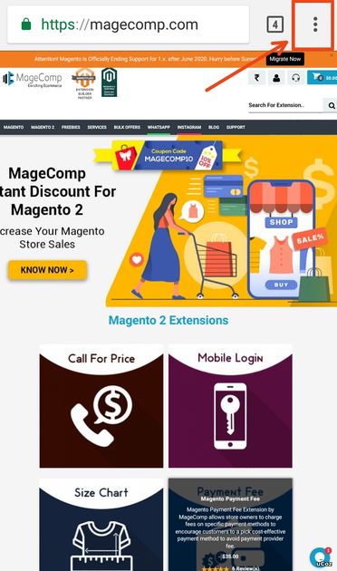
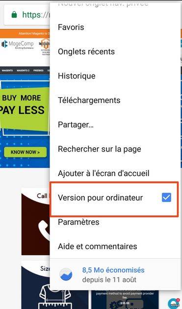
upgrade your store with magecomp.com |
Attachments:
6487465.jpg
(113.3 Kb)
·
7871291.jpg
(85.0 Kb)
A person who never made a mistake never tried anything new
Post edited by steven4u - Tuesday, 2019-09-10, 11:03 AM
|
Post text
Attachments:
3142704.jpg
(4.9 Kb)
|
| |||
| |||

Need help? Contact our support team via
the contact form
or email us at support@ucoz.com.


