

| uCoz Community General Information uCoz Updates & Announcements New Standard Templates for uCoz Websites |
| New Standard Templates for uCoz Websites |
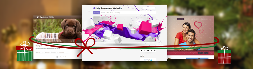 The holidays get closer and closer, and our presents get more and more interesting! A lot of you have been waiting for this update and here it is — new modern responsive templates for your uCoz websites! We've added 32 free templates to the default template gallery. Responsiveness means that a template will look perfect and be fully functional on any screen resolution and on any mobile device.  This release includes the updates of the following template categories:
You can't wait to update the template of your website? Just go to Control Panel -> Settings -> Common Settings, and choose a design you like. When you install a new template, the site entries and pages are not deleted. However, if you have custom scripts installed on your website, they may be lost. Therefore do not forget to create a template backup (that you can restore at any time if you need to get back to your previous template). And as usual, all of the templates are customizable, so even if none of the new templates is suitable for your site's theme, you can change a few pictures and/or colors to get the result you need. And that is not all. We have a new batch of templates ready for the testing stage! The next update will be larger than this one. We keep developing and improving the standard templates, so follow the news! Feel free to experiment with the templates, try something new! And if you have any questions or comments, they are very welcome 
I'm not active on the forum anymore. Please contact other forum staff.
|
Sunny, looks something new I will check it out
 My immediate review: *The new template Design #1231 menu is bug. *Kindly check it out Madam. *I beat this template. Design #1211 >> Its a minecraft template with sculptural design. *Design #1181 a unique style >>> trully unique just check it out. *Design #1101 & all misc. templates. Best for blog. The 1101 has a WordPress bottom. 1F4BF3B
Post edited by Cyberdasm - Tuesday, 2014-12-23, 1:43 PM
|
Great work.
Keep in mind to always look for good colors and contrast combination on the default templates. Some colored links & elements are very hard to see. Like light colors on light background. There is a problem with this on the first batch of responsive templates too. Maybe they can look into it and fix/adjust those colors that make your eyes bleed to something more visible and pleasant. (especially in forum section where the color links are very annoying) Thassos Island Portal :
https://thassos.one |
Urs, thank you for the suggestion, I'll forward it. But remember that all templates are customizable and you can easily change colors. If you need some help, just post a thread in Design Customization.
I'm not active on the forum anymore. Please contact other forum staff.
|
Quote Sunny ( Urs, thank you for the suggestion, I'll forward it. But remember that all templates are customizable and you can easily change colors. If you need some help, just post a thread in Design Customization. Thank you Sunny. Fortunately because of this great uCoz community here, over the years i leaned how to do it. Of course there are more complex things to learn (like making your own template from scratch, using php or making heavy changes to the structure of existing templates), but this (good default color links & elements in templates) can be helpful for new people that have a first impression and don't know immediately how to change the colors. Let me give you a more detailed description of the problems. Design #1041 - the yellow links are too bright and not visible in forum and anywhere else in the site. The yellow headers of global blocks are hurting your eyes with the white text on them. Design #1061 - the blue links are too bright. The hover color for the links in the menu also too bright making text hard to read. Design #1071 - the forum fonts are way to big, some menu items are not very visible, the blue links are a little too bright and fading. Design #1111 - Invisible text on menu, black text and very grey menu, needs change. Important information in forum is written grey on grey, almost invisible ! Design #2011 - forum information and menu links buttons are white on light blue background. The red links are also too bright on that white background. Design #1072 - the forum fonts are way to big. the menu is barely visible Design #1073 - the forum fonts are way to big, the orange links are making the eyes bleed by being invisible and very bright on white background, menu is also hardly visible. Design #1074 - huge forum fonts Design #1075 - huge forum fonts, links are fading. Design #1082 - The links are fading in forum especially. (light brown on white background) Design #1083 - the orange links are hard to see. Design #1085 and Design #1087 - the forum header colors are really hurting your eyes. This needs urgent fix. Links are also too bright and hard to see. Design #1088 - light blue is too bright everywhere. Design #1089 - a little too bright orange. Design #2012 - green a little too bright. Design #1062 - very light blue links too bright and invisible on white background. Forum is hurting your eyes because of this. Design #1063 - forum name too bright and not saturated enough. Design #1064 - blue green links are very bright, horrible and extremely hard to read. Design #1090 - urgent fix needed. Extremely bright colors in forum. Links are ok but forum colors with two types of bright green make it impossible to use. **************************************** So these templates need to be adjusted in order to make them useful out of the box. The first group of responsive templates suffers greatly from these issues and need to be adjusted, not abandoned, because it would be a waste of work and time to make templates and chose bad colors for them. ***************** The new group of responsive templates are excellent and i sincerely congratulate you for that ! However problems do exist and i will point them out. Design #1151 - forum description is invisible because of color. "My profile / Log out / Log In" and "Copyright MyCorp © 2014" at the bottom use the same almost invisible color. Remember that some search engines can consider these kinds of stuff as hiding keywords. Design #1255 - 3D type menu not looking great. It is easier to read a flat menu. In forum fonts on : category & Additional information are too big and look awkward combined with that 3D menu. Design #1251 - forum links and site links a little hard to see because they are too bright. Design #1281 - fonts are a little too big and some green links are too bright. (Updates) Design #1257 - Again 3D menu doesn't look good at all. It is easier to read a flat menu. In forum fonts on : category & Additional information are too big and look awkward combined with that 3D menu. Design #1221 - green links not very easy to read. Design #1132 & Design #1133 & Design #1134 - too big forum, menu link colors too bright hurting eyes. Too bright social comments icons at the bottom. Hover over links too bright. Design #1254 - orange links too bright on white background. Unreadable. Design #1141 - Menu links are barely visible. Maybe use a different green as background elements. Design #1271 - site is barely visible. Menu link not visible, site news / Blog section comments area not visible (dark violet on dark background). forum description not visible, date time not visible. Design #1291 - Orange links are too bright everywhere. Design #1301 - green links too bright everywhere. Eye bleeding. Design #1171 - too bright and intense compared to the perfect Design #1161 Design #1191 - way to bright pink link, menu and global block headers. Forum also very bright. Design #1261 - Extremely bright yellow colors for menu,site news/blog comment section / forum links and site links. Design #1322 - too bright compared to the perfect Design #1323. Design #1321 - should use the same intensity of Design #1323 too. **************************************** As you can see there is a common mistake in many of them. Hopefully they will consider making adjustments ( instead of abandoning them ) and in the future stop producing too bright colors where they hurt the eyes or where they make things unreadable. Thank you Sunny and forward this. Thassos Island Portal :
https://thassos.one Post edited by Urs - Wednesday, 2014-12-24, 10:47 PM
|
Cyberdasm, I asked you to provide more details (message 3)
What browser do you use? Do you have a screenshot of the problem? What website do you have it at? Urs, your comments have been forwarded to the person in charge. I'm not active on the forum anymore. Please contact other forum staff.
|
It seems all the old and new responsive templates have the same problem with admin bar.
When I resized window, the admin bar disappeared although I was in the administrator group. Then I maximized the window again, the admin was there but there was no navigation menu. Please refer to attached screenshot. I have tested on Firefox and Google Chrome and both of them have the same problem. I dont know this is the new update or bug. My site: adnet.at.ua (the problem also happens on other sites). Thanks! Attachments:
4115798.jpg
(179.3 Kb)
·
6265734.jpg
(64.8 Kb)
Post edited by Good - Saturday, 2014-12-27, 7:28 AM
|
Good, showing the adminbar on mobile devices returns bad results in the responsivity. That's why the admin bar is hidden when you resize the window. As about the navigation menu, I'll look into the situation.
hey i'm joe and i do not work for the company anymore, please contact tech support for help!
sometimes i lurk here |
Good, cookie-clearing may help you: http://faq.ucoz.com/faq/32-1
hey i'm joe and i do not work for the company anymore, please contact tech support for help!
sometimes i lurk here |


| |||

Need help? Contact our support team via
the contact form
or email us at support@ucoz.com.